Wednesday, 18 January 2012
I keep my mind open
I do that partly because I am creative more than logical.
I am not offended by art, because art opens up a persons personality. I explain myself through words and imagery rather than finding out reason for the way I am through facts or science. All in all, in the past year, I feel I have really developed as a person and know I can push myself further.
Tuesday, 17 January 2012
Thanks for asking me for this online digital portfolio:
I have been working on everything in this portfolio for almost 2 years, so I hope you like it. This portfolio consists of; Computer Arts: Animation, Typography, Illustration, Logo Design, Poster-based Advertising, Website Design, Photography and Magazine Design.
Manual based art: Observational and Experimental Drawing.
I was only asked to put up to 12 images so I tried to choose broadly.
I am passionate about Graphic design, that is why I want to pursue the path through university and be a successful designer/director. I know I am passionate because I still like to design as my hobby. What's better than doing something you enjoy as work? I like to construct new ideas in form of sketches and finalize them also as a digital piece. I don't like to leave things half done. I like to experiment with my ideas and try things in other forms, such as swapping my typography and imagery ideas in the same brief to find the best fit or trying new materials and processes. I don't mind being given criticism I see it as a milestone that leads to more experimenting to find the best outcome.
I want to join your programme because the types of graphic design areas covered are my most preferred. I like the area you are situated in and think the university will be a great place to study.
Observational illustration digital

'mi Adidas' advertising brief

"See how I'd look, with these trainers I designed, and this woman!".
My inspiration was based on other shoe designers' advertisements, including Nike, Reebok, and Umbro. I wanted to be unique and go for something which would definitely attract my target audience so I used women as imagery. The silhouettes give off the image of a beautiful woman standing behind you looking round at you with the trainers in the foreground. They remind you of stereotypical beautiful woman (blonde hair and slim).
Website brief screen shots

All work came with development in a journal which recorded my progress from start to finish with many screen shots along the journey. I am happy with the outcome. My typography for the logo is also in a contemporary style.
Harley-Davidson animation

Illustration for Portfolio
Urban styled skateboard


This was my favourite design I produced. I initially designed this as a pencil drawing and then I fine lined it. I also applied it to acetate and onto this fabric where I made a print screen. I noticed that certain areas have bled too much. This is because on my first stroke I put too much pressure on the screen so any stroke after that to put the print on the fabric caused the bled areas to get even thicker. I tried a couple of times on other fabrics but after that first stroke on this image I must have ruined the screen.
I have images of the different material techniques but I thought I'd add this to my portfolio instead of them ones because I'd only be showing the same material techniques as the others for this brief below.

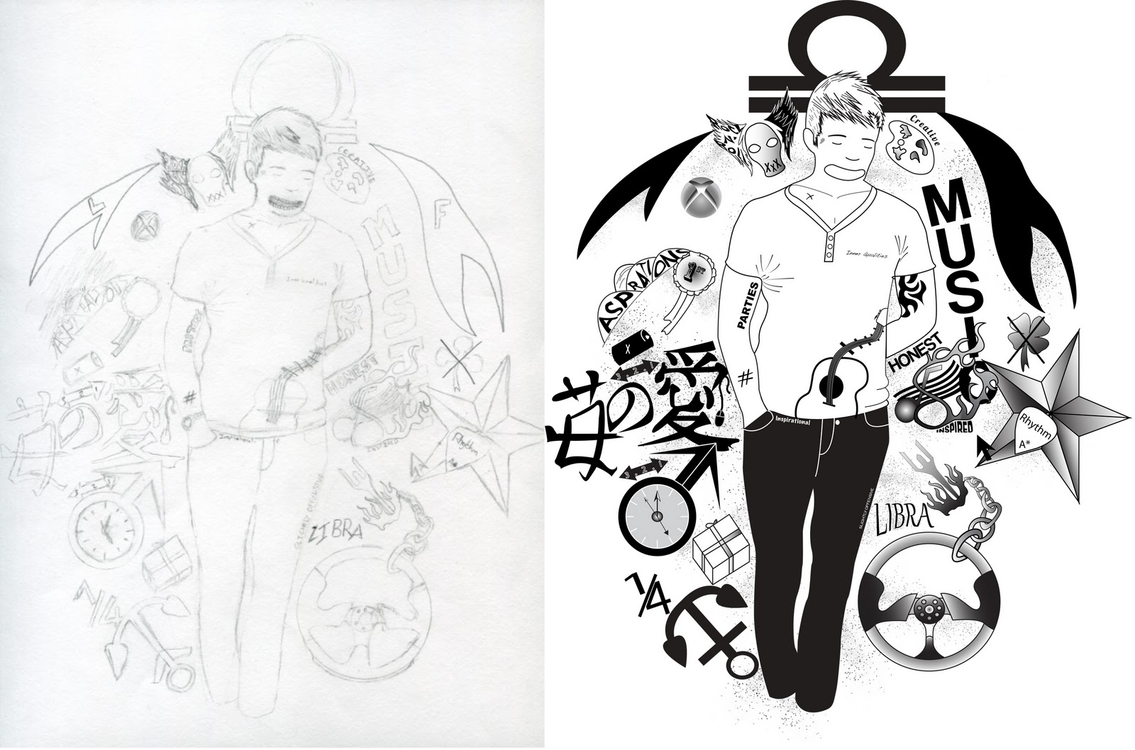
Religious style tattoo sketch 1

Skullcandy and iPhone advertising poster

Vector of Heimdall

Animal and Man photography manipulation

Subscribe to:
Comments (Atom)